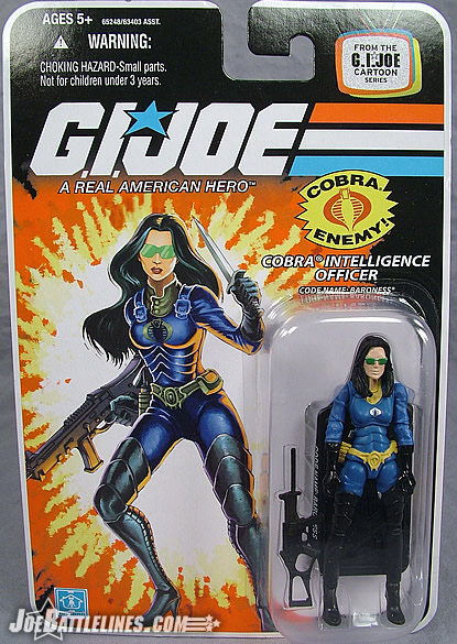
There's just some appealing about the concept of the "femme fatale". Whether it's Angelina Jolie in either "Tomb Raider" or "Mr. & Mrs. Smith" or Lauren Bacall in "To Have and Have Not", the strong independant and dangerous heroine is one of the most appealing concepts in fiction. Perhaps it's that archetype of a strong confident woman who walks in the world of men as a feared adversary that has made the Hama-created character of the Baroness so appealing. Initially created to balance out Scarlett in the GIJoe roster, the Baroness evolved into a pivotal character in her own right-- and she certainly made her mark on GIJoe continuity. When the 25A style of figure debuted, it only made sense that the Baroness was one of the first characters to be released in this new "no-ring" line. However, many fans were unhappy with the first version due to her limited articulation and somewhat bland head sculpt. The folks at Hasbro took notice and now, nearly a year later, a second version of the Baroness Anastasia DeCobray is making an appearance on retail shelves. Whether or not this figure is the hoped-for improvement remains to be seen.
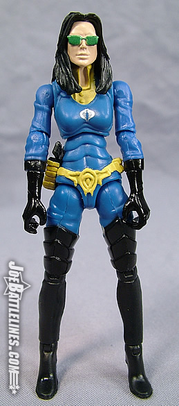
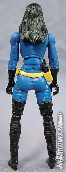
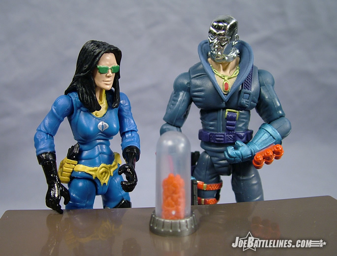
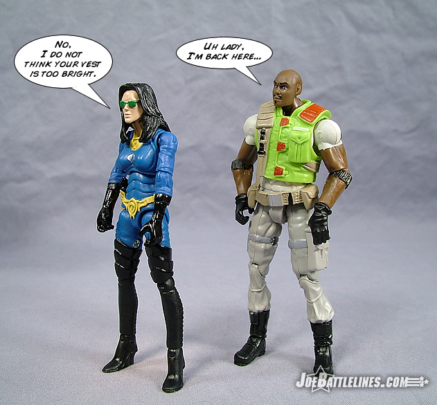
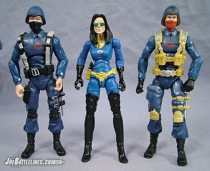
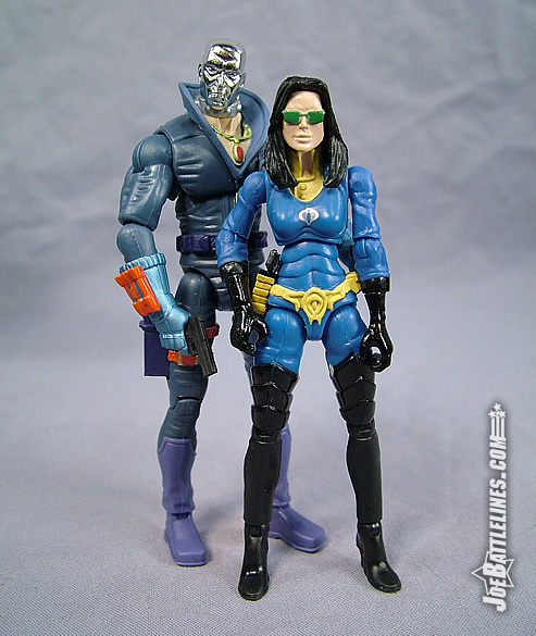
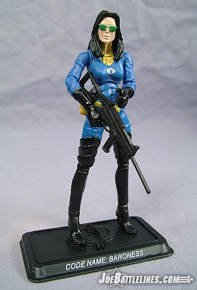
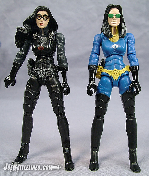
Okay, first and foremost this is the same Baroness mold that was released in the debut Cobra five-pack. The entire body, save for the head, has been reused here with a slight alteration found in the hips of the figure. The Baroness can now sit down without doing an exaggerated “Sharon Stone”—much to the chagrin of Shipwreck and Clutch. However, fans expecting a brand new Baroness figure will be somewhat disappointed as the biggest change to the character’s tooling is the slight alteration found in the hips. However, in terms of color scheme this figure couldn’t possible be more different from the first Baroness figure. Whereas the debut version of Anastasia was presented in her classic black uniform, this version takes a decidedly more comic book approach. The black body suit is gone—replaced with a bright blue model that features a painted yellow collar and belt. The figure’s sculpted thigh-high boots are brought in to sharper contrast as are the sculpted gloves in the respect that they are the only portion of the uniform that retains the more familiar black color. The figure’s uniform is capped off with a diminutive silver Cobra sigil located in the center of the figure’s chest. In terms of color scheme, I don’t see this as any real improvement over the first Baroness figure. It’s a bit too gaudy and too bright for me to take seriously as the uniform of Cobra’s “Queen of Intelligence”.
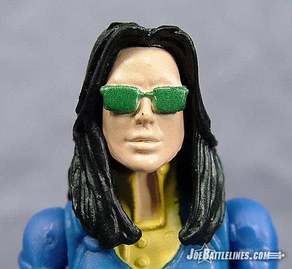
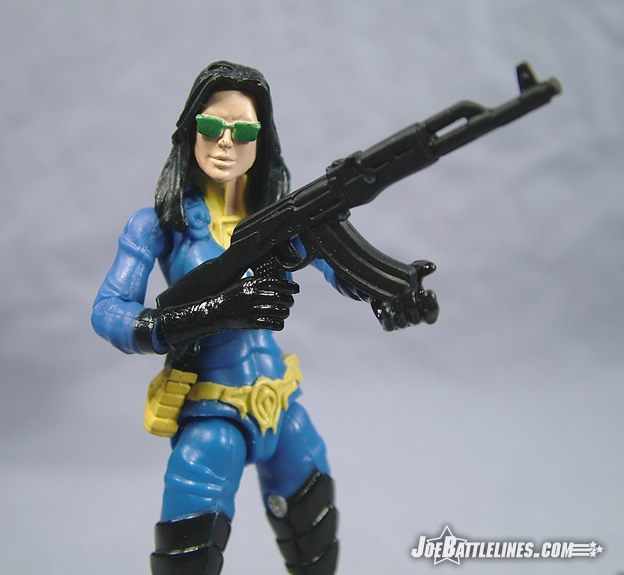
Does anyone remember Destiny, the blind clairvoyant from the pages of the Uncanny X-Men (back when the title was still readable) whose prophesy-filled diaries led all manner of mutants on a quest to discover their ultimate fate? Well, it would seem that the Baroness is either a fan of Destiny or is extremely light-sensitive as this new head sculpt is sporting a pair of shades that Stevie Wonder would describe as “making the room too dark”. Rather than the soft rounded features of the first Baroness figure, this version presents a more angular look with a slightly squared jaw and severe straight hair. It’s a sculpt that almost works to recapture the early appearances of the Baroness if it weren’t for the fact that the painted green sunglasses convey the appearance of someone who has lost their sight. Seriously—I don’t know what it is but the glasses completely put me off of the head sculpt and I can’t help but wonder how much work Destro is going to have to do to his Scottish castle to ensure that Anastasia can live comfortably without her sight. I’m going to pass the keyboard over to Justin now as I really can’t find anything objective to say about this particular head design. For whatever reason, I simply cannot get over my initial impression.
Well, there are limitations to what you can do with a figure in the 1:18 scale, and it looks to me like Hasbro was simply trying to capture the fact that back in the early days, the Baroness DID wear green-lens sunglasses, that was a pretty cool unique trait of how she appeared back then. Of course you can’t really do transparent green lenses on a face sculpt that small, so they did it this way, and while it may not translate perfectly in that small a size, I think it looks fine.
The head sculpt is actually one of the drastic improvements of this figure, in my opinion. I had no serious issues with the previous head sculpt besides the fact that she looked a little too “nice”, but that’s not a problem we need to worry about here. The slightly more angular sculpting makes her look a bit more determined and intense, which I think only helps the character along. Even with that little hint of a smirk on the face, the head sculpt here is miles ahead of the previous version we got, so that’s a nice change, anyway.
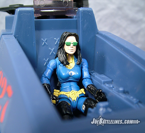
As for her body sculpt…well, let’s face it, the original Baroness was definitely “the goat” of the original 2 5-packs, so they could only go up from there, and I think they did. At least on my figure the mid-torso articulation is much improved so she can actually stand upright instead of being trapped in her “hunchback” pose, and as Fred already mentioned the improved hip articulation helps quite a bit as well. I think the uniform colors are a nice tribute to her early designs in the comic and the cartoon, even if they don’t capture how she appeared there perfectly. Still, this blue and yellow color scheme instantly identifies this Baroness as being the early appearance Baroness, and that works for me, even if the figure isn’t perfect.
I’ll be honest—this is another one of the figures in this particular wave that I wouldn’t have purchased if it weren’t for that fact that Justin and I had reviews to write. The slight improvement in the hips helps the figure sit somewhat better but the overly-bright color scheme and the “not quite on” head sculpt don’t prove to be different enough to justify the purchase of this figure when I already own the first version. I realize that Hasbro is working to clarify some of the issues that fans had with many of the earlier figure and I can appreciate their efforts. However, this is one figure that I’m going to have to take some time to warm up to. For whatever reason (I’m thinking it’s the yellow paint), this just isn’t a figure that I feel is one that I can recommend to most fans out there. Justin might think I’m a bit harsh on this particular inclusion in the wave but I feel a resounding “meh” coming on whenever I try to describe it.
Nah, I don’t think that’s especially harsh, though at the least this figure IS an improvement over the original. Still, Fred is right, this particular wave of figures has been ripe with repaints (and repaints that I didn’t personally see any need for) which tempers enthusiasm for review writing a bit. Still, at least they didn’t just slap a fresh coat of paint on (like COBRA Commander, where they BARELY slapped a “fresh coat” on), we actually got a somewhat decent new head sculpt out of it, and improved articulation. Still, like Fred said, this isn’t a figure that jumps out at you, and if it hadn’t been released I don’t think anyone would have really called for it.