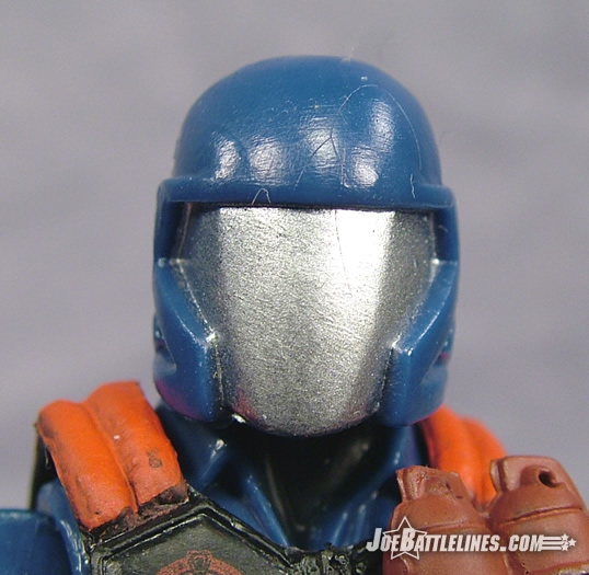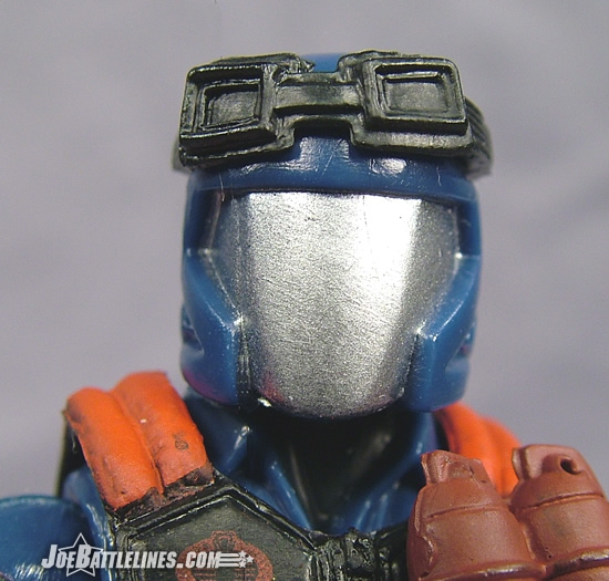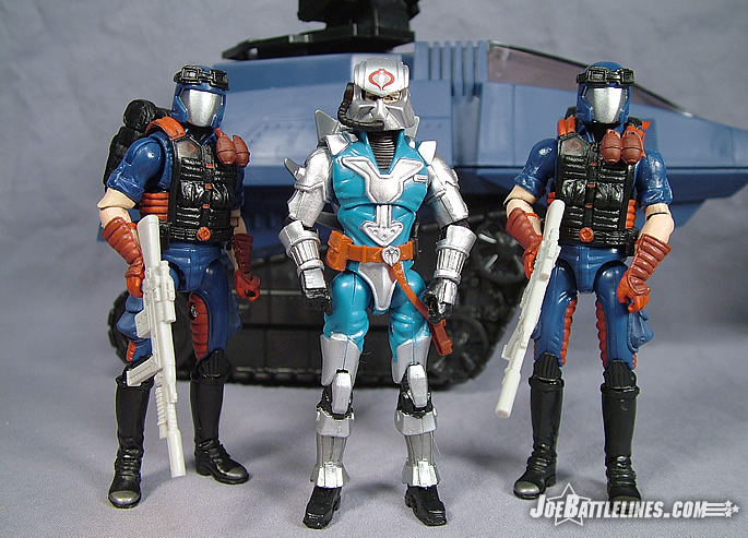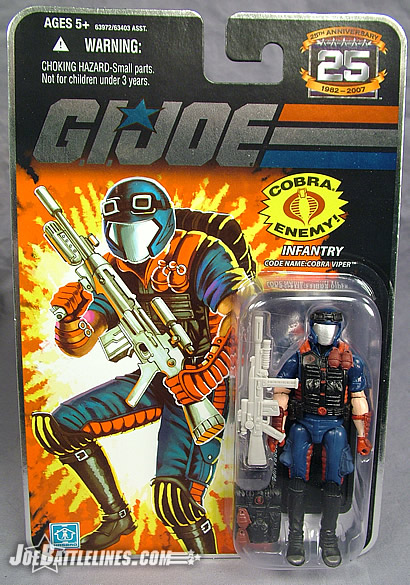
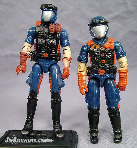
When the GIJoe line debuted in 1982, the signature soldier of Cobra was the now-classic “blueshirt”. Clad in a utilitarian navy blue uniform with the facial features covered by a scarf, these anonymous soldiers comprised the vast hordes of Cobra. For four years, they served as the backbone of the organization that kept GIJoe on its toes. However, in 1986 Hasbro decided that the forces of Cobra Commander (and soon to be Serpentor) needed an upgrade. Changing times required a more “hardened” soldier whose very character design suggested a rugged combat-seasoned individual whose very presence indicated that the battle for freedom had just intensified. Clad in a more detailed set of “battle fatigues” and topped with an all encompassing silver-plated helmet, the Cobra Viper soon became the combat arm of Cobra—the very fangs of the organization. An instant hit with fans of the line, these troopers remained a mainstay of original line up until it’s cessation in 1994. It seems only fitting that Hasbro bring these classic troopers forward into the 25th Anniversary line.
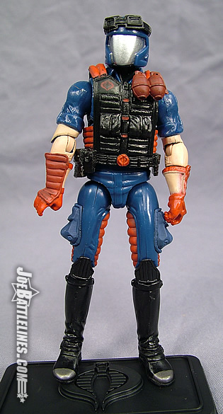
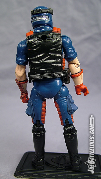
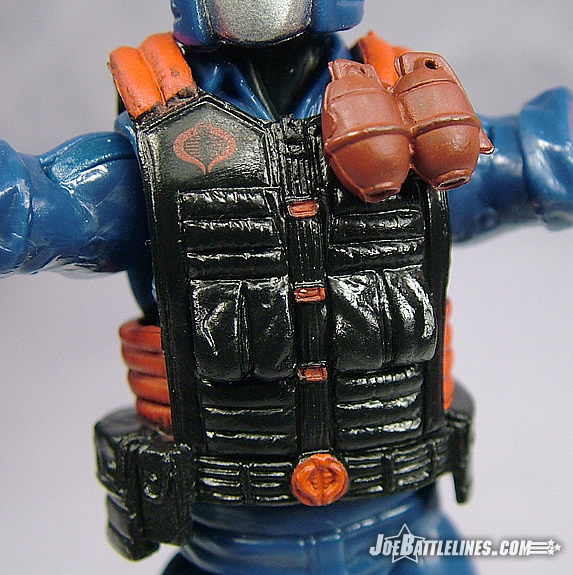
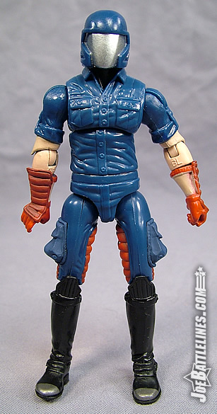
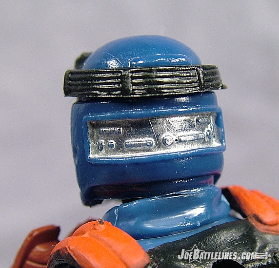
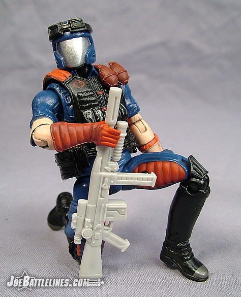
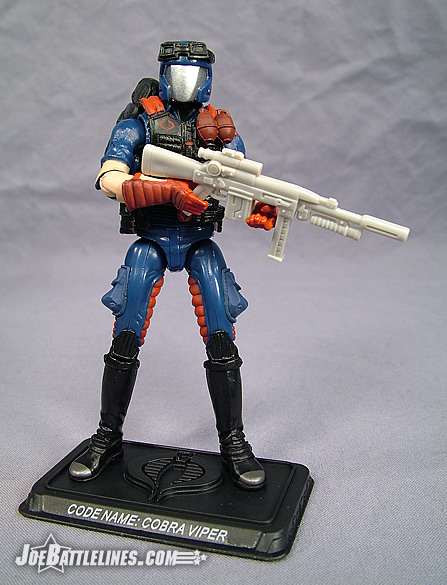
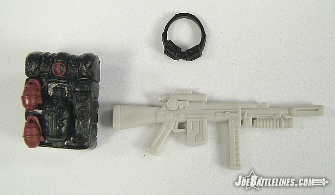
In terms of recreating the original character design, I can find no fault with work that the design team has put forth. From the rolled sleeves to the padded forearms guards to the high black boots, the original Viper uniform is replicated down to the minutest detail. The large pockets are present on the out seams of the legs and the peculiar “tech” panel is even found on the back of the helmet. The Viper is one of the privileged figures in this line that enjoys an entirely new body sculpt including a brand new “plain shirt” torso. (I’ve no doubt whatsoever that we’ll be seeing more of this torso used for plenty of other figures in the line.) The signature look of the Viper’s chest is accomplished by the use of removable rubber vest that features some of the most intricate detailing on the entire figure, included two attached grenades and more pockets than Snake Eyes has versions. There’s even a painted Cobra logo just below the right shoulder and a sculpted Cobra logo on the figure’s belt buckle. In terms of faithful updates to classic designs this is one of the best. One change that I’ve notice in terms of the design is found on the inseam of the figure’s pants where two red padded sections have been added. This was not found on the original Viper design but rather on the uber-slick Valor vs. Venom design—most notably in Wave 7. The added color helps to break up what would otherwise be nothing more than a sea of navy blue and I think that it works well to add just a bit more detail to an already well-designed figure. This is one area where I’m sure that Justin and I can agree—this figure’s character design is rock solid.
It’s absolutely amazing to me how much more improved the sculpting and detail work is now than it was twenty years ago. I’m as nostalgic as the next guy, and the vintage style is still far and away my preferred medium of choice when it comes to 3 ¾” figures, but if you just sit down and look at the sculpting on these Anniversary figures compared to even the later run of the new sculpt stuff, or the vintage stuff, and they are worlds apart. I’m not sure if it’s the actual skill of the sculptors (I’m inclined to say that’s not really a part of it) or more likely the technological advances of the equipment available to actually produce these pieces, but it is great.
One of the coolest things about this figure is the relatively plain “underfigure”. While the secondary vest immediately identifies this guy as the venerable COBRA Viper that everyone knows and loves, you take that vest off, and you have a “plain clothes” COBRA operative that can be used as the foundation of a technician, mechanic, or any other number of less elaborate COBRA soldiers. This is the kind of nice touches that makes these Anniversary figures sort of stand out from some others out there. Even with the construction differences there is a certain level of customizability that’s not there with other Joe formats, or other toy formats in general.
The legs are also faithfully reproduced here, which is especially nice, since we haven’t had a COBRA Viper figure with the proper legs since the “old days”, and the look translates well to the 25 th Anniversary style as well. Conceptually, and from an overall design perspective, this figure is great. It has a ton of potential. Unfortunately it’s a mountain of potential and an anthill of actual execution.
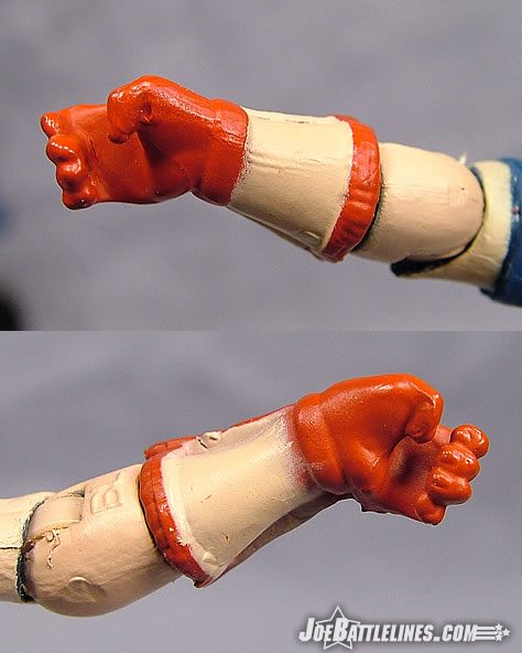
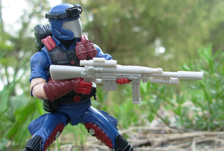
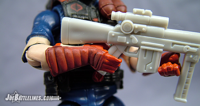
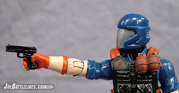
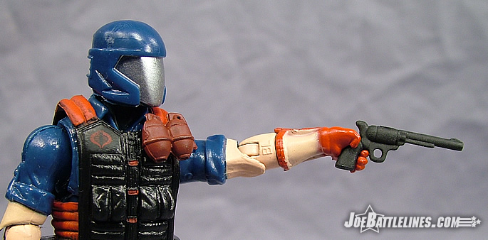
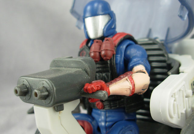
If the character design for this figure is rock solid it’s the design of the figure itself where things fall apart quickly. The 25th Anniversary line has had its share of design issues in previous waves and, by this point in the line, fans would start to expect to see this issues corrected. After all, the design team now has seven waves of single-carded figures under their production belt. It’s true that many issues have been addressed and improvements have been made but the Viper represents about seven steps back in terms of progress. First off, this “signature trooper” has been handed one of the most exaggerated set of pre-posed hands to be found in the entire line. Rather than sculpting the figures hands in the typical “neutral pose” that is found on most 3.75” GIJoe figures, the design team opted for best wrists on both hands—with the left hand receive the most exaggerated pose. As a result it is almost impossible to achieve any real variety of grips on the figure’s included rifle. (This is also complicated by the added thickness of the figure’s removable vest which makes two-handed poses extremely difficult to set up.) The figure is able to hold the rifle loosely in something vaguely resembling an “at rest” stance but even that is tenuous if both hands are used in trying to stabilize the weapon. At best, the figure can hold the rifle with his right hand leaving the left hand useless. However, the “fun” doesn’t stop with the proposed wrists on this figure. Out of the package, my Viper wouldn’t stand. The now-standard ankle joints found on most figures in this line are hindered by the placement of the joints in the sculpt of the boot. I literally had to pull the foot away from the leg, stretching the soft plastic peg that attached it to the larger piece before I could adjust the joint forward enough to allow the figure to stand on its own. While some fans will accuse me of “nit-picking” the line or just being an “25th hater”, let me state that I expect an action figure to be able to achieve a functional range of poses with its included accessories right out of the package with no modifications. In other words, I expect that the figure be “good-to-go” at the time of purchase. With the Viper, it seems that form was much more important than function as the figure doesn’t feel properly thought out or tested—if it had been, these issues would not be present in a final production model. My last issue with the Viper is one that has plagued this line from the get-go and that is the inconsistent use of painted parts. Some figures have parts that are molded in a primary color with only the necessary details painted on. Other figures feature parts molded in an entirely different color than what is needed and then covered in paint to achieve the final look. The Viper is a great example of the latter design implementation as one look at the figure’s hands will bear testament. Rather than mold the pieces in a flesh tone and then painting the gloves and guards red, the entire forearms are covered in paint applications. Worse yet, the applications are thick and sloppy with the red bleeding over into the flesh tone more than should be expected. It’s sloppy workmanship, plain and simple and not something that I’ve come to expect from Hasbro. With the increased cost of the figures at this point in the line, I expected better from the largest toy manufacturer in the United States. Justin might feel that I’m being hypercritical but I’m standing by my opinions on this one.
Not at all, Fred. I find this figure to really be a shame. It’s a big step backwards right when it seemed like the Anniversary was flying full steam ahead. Ever since the first Duke release, fans have been clamoring for the right combination of “form vs. function” and things seemed to be getting a lot better. It seemed as if the design team was really listening with figures like Torpedo, Battle Armor COBRA Commander, Snow Job, Iron Grenadier Destro, Tomax & Xamot…all of those figures managed to be dynamically sculpted and incredible looking, yet still managed to retain functionality in multiple poses and not be locked into a single position. There was no fan backlash asking for “fixed” versions of already released figures (as there were after the first 2 boxed sets with the hip articulation and arms on certain figures). Yet, here we are almost a year removed from that and once again the fans are demanding a “fixed” Viper.
Why is this necessary? Why permanently sculpt the Viper’s hands so that they can only achieve one pose when the beauty of G.I. Joe is the articulation and versatility the action figures offer for poseability and display? Pre-posed figures work okay for Star Wars and Indiana Jones…often times those figures are replicating specific scenes from a film. But the draw to G.I. Joe has always been for the past twenty-five years, that the figures are the most articulate, versatile, and mobile figures available in this scale, and collectors and kids alike want figures that hold multiple poses without looking silly. Sure, the Viper looks amazing while firing his weapon left handed with his right hand posed on the weapon, but what else can he do? Nothing. Standing in formation (as so many army builders like the figures to do) he just looks ridiculous with his hands sticking out askew. Why make figures so poseable if they only look acceptable in a single pose? The very essence of G.I. Joe is defeated by this single sculpting decision, and it’s VERY bothersome because so many people have been looking forward to this figure for so long. It’s really a shame. If the designers and sculptors are so insistent on hands that only look good doing a single thing, perhaps we should start seeing some removable hands (or forearms, depending on the figure) so that the collectors can choose if they want their figures firing weapons, or just standing at attention…that might make both sides happy and give us even more options.
I’ll be blunt—the Viper is a real and true disappointment in my eyes. The exaggerated sculpting of the forearms, the limited functionality of the ankle joints, and the sloppy paint applications on the hands combine with the figure’s inability to truly take advantage of his included rifle to produce a figure that I would have expected in a first wave—not the seventh. This figure was Hasbro’s chance to fix all of the design issues found on the previous waves in the figure that was guaranteed to be their biggest selling troop builder to date. However, it seems the design team felt the need to introduce new issues and cover them with paint applications that look like they’ve been applied by a trowel. This figure was going to be one of the releases that served as an opportunity to win over a great many fans to this new “no-ring” construction style once and for all. Instead, the Viper ends up as one of the weakest figures of the past few waves and real disappointment to anyone who was planning on army-building these figures in any quantity. Like many of the other figures in this wave, the Viper stands as an example of a great design executed in a mediocre fashion. I’ll pass the keyboard over to Justin now as I’m hoping his final thoughts are a bit more optimistic than my own.
Maybe my disappointment wouldn’t be so palpable if this wasn’t “The Viper”. The essential backbone of so many collectors’ COBRA armies, fans were SO looking forward to this figure, and this could have been an absolute sales blockbuster. Fans want to buy hundreds of these figures…they’re dying for it. But because of this single hand-sculpting decision I honestly believe that will negatively impact thousands of sales as fans wait to see if the figure will be “fixed” down the road, or they just don’t want a figure that only looks good in a single position. Maybe if this was a single character or some sort of niche trooper it wouldn’t be such a major thing, but the fact that fans would love to buy dozens (or even hundreds) of these Viper figures only to have the hands look the way they do is a massive, massive disappointment.
Now seeing what figures are still to come, it seems as if this Viper figure is the exception rather than the rule. I don’t see these pre-posed hands on Wave 5 figures, so I can only hope maybe we’re moving in the right direction, but the fact that the COBRA Viper of all figures gets this treatment is frustrating, since so many people were looking forward to it.
The ankle joints and standing problems are another additional negative point against the figure as well. A trooper figure that doesn’t look good at rest and can’t even stand at attention? I thought we were past this point, but hopefully from here on we can make more strides in the right direction. Unfortunately the fantastic sculpting and design of this figure (not to mention the great accessories) are all over shadowed by the faults in the hands and the ankles. You can even tell by this review… ;)
So are we stuck with these hands now for every iteration of the Viper coming down the line? Are we to expect 3-Packs, Comic Packs, 5-Packs, etc… with a contorted COBRA Viper figure? I certainly hope not, but fans waiting for a better version will dramatically impact the sales of this version, which is too bad, because this could have been big. Really big.