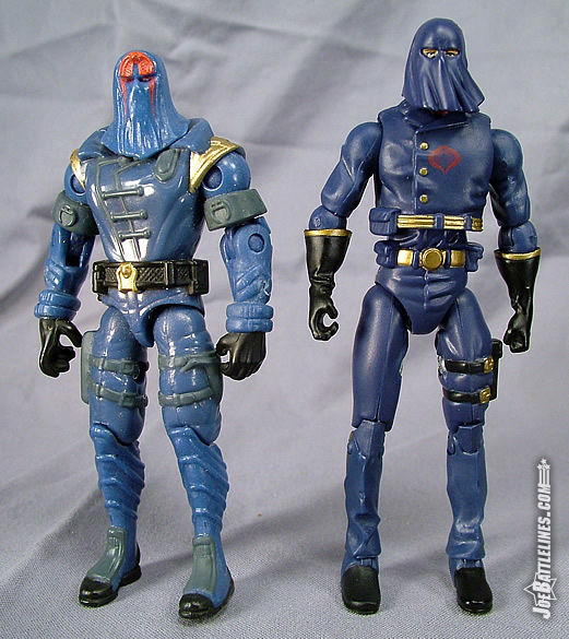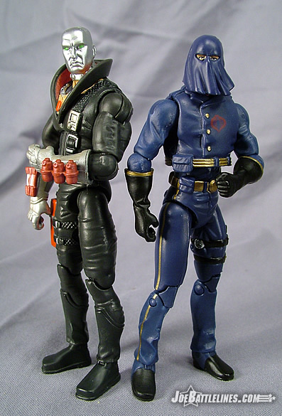
It seems inevitable that with any new series of GIJoe figures come various repaints and parts reuses. Recycling existing parts saves the manufacturer money while also offering up a greater variety of characters. The original 1982 Joes were a terrific example of this philosophy where an entire wave of figures was constructed from only a few basic body types and head molds. With the new 25 th Anniversary line paying such close homage to the original ARAH era, repaints were inevitable once again and Hasbro embraced this business practice. Now, I have a dirty little secret to confess—I have never owned the original 1984 hooded Cobra Commander. For some reason this figure just slipped through the cracks in my collection as a young Joe fan. He has proven equally elusive as an adult as I’ve yet to acquire one. I’m not certain what it was about the first major repaint of Cobra Commander—perhaps the overly large eye sockets in the cowl—that just failed to ignite the spark of interest in me. Regardless of the reason, the 25 th Anniversary rendition of this classic deco has only recently appeared in my collection and I can say that this is a superior figure to the previously released use of the mold.
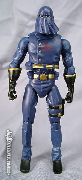
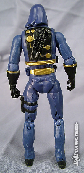
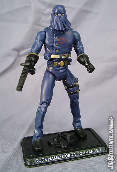
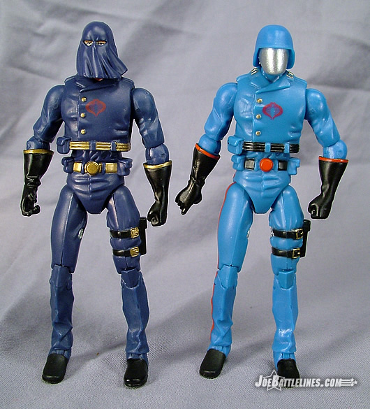
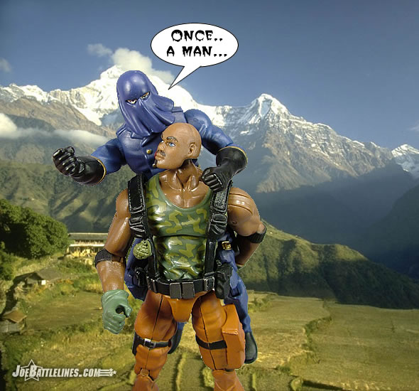
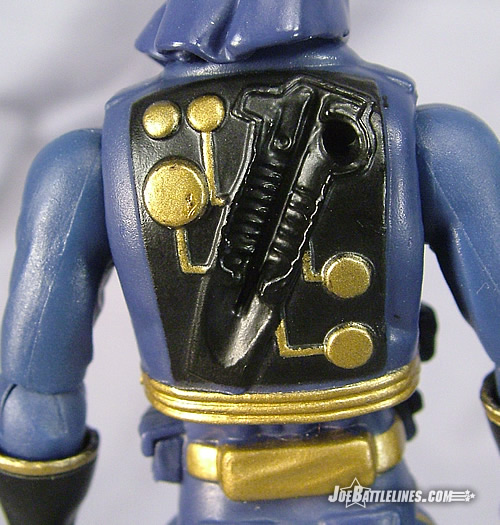
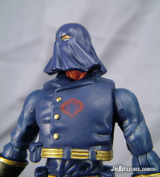
If the battle pack Cobra Commander was the “cartoon” rendition of the character then this version is the “comic” incarnation. The overall body is molded in a much darker navy blue plastic which gives the figure a much more menacing aspect. The uniform is now highlighted with gold accents on the torso and the gloves as well as gold buckles on the sculpted leg holster. Even the red stripe on the right leg is now rendered in gold instead of the red used on the helmeted version. It’s also interesting to note just how closely the color scheme of this figure matches the 1984 version; the figure’s neck is painted red to match the original figure! The Cobra sigil is still small and is still cast in red although the shade might be slightly darker than the first release. The overall combination produces a version of Cobra Commander that, like his color palette, is much darker in tone than the battle pack version. This figure is automatically NOT the more comical cartoon character presented in the Sunbow animation. This is the former used car salesman who founded one of the most dangerous terrorist organizations in the world. The gold trim and accents make this a slightly more ceremonial figure than the lighter blue premiere version but this is also the version of the character that I see much more at home in a command center than on the battle field. Ever the master strategist, this figure would be right at home in front of a tactical plot, moving troops as a chess master moves his pawns to his advantage. With only two versions of the Commander released in the line, it’s not hard to see which one is my preferred version. It is ironic to note that the gold piping found on the figure doesn’t actually appear on the card artwork.
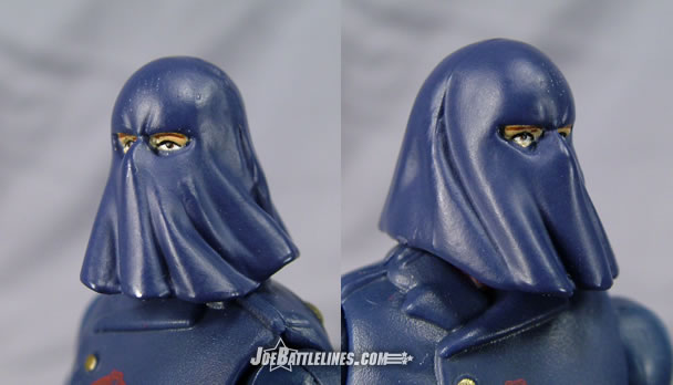
I’m not usually a fan of the “dynamic” head sculpts. I’ve always preferred my figures to maintain a more neutral countenance so that their environment dictates their expression. The initial GvC Cobra Commander is a great example of this “neutral sculpting” as is the 1993 Battle Corps version. Both of these figures featured a naturally draped cowl as opposed to a “where’s that draft coming from?” sculpt. That being said, I find that I actually like the slightly swept look that this particular head sculpt conveys. It’s not as exaggerated as the accessory hood included with the VvV wave 7 Commander but it is slightly more dynamic than my usual preference. For me, it is the cold set of the eyes and the properly scaled (IMHO) eye holes that make this head sculpt work as a proper rendition for the “most dangerous man alive”. I’ve never been a big fan of cowls that reveal too much of the face underneath and this cowl offers only a glimpse at the eyes, which are the “windows to the soul”. If this is true, then this figure has a very dark soul indeed. This figure also has a slightly larger head than the helmeted version, which almost hints that two different sculptors worked on the various versions of the character.
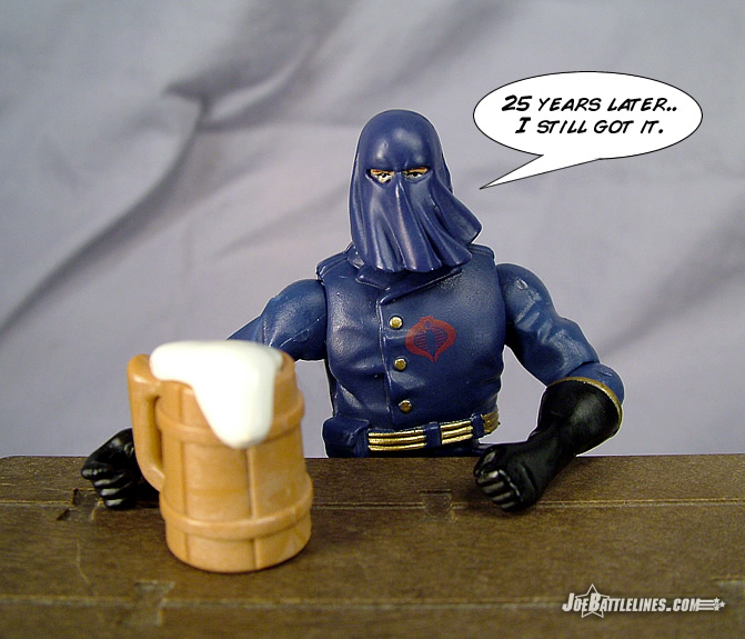
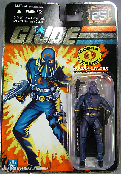
I won’t go into the articulation limitations found in the new 25 th Anniversary design as this was covered in my review of the Battle Pack Cobra Commander. This is the exact same body as the previously released version so the same comments apply. If you have no issues with that figure then you’ll have no problems with this one. If you did, then expect the same to apply here. Cobra Commander, like his previous version, comes packaged with his venom pistol and a character-specific figure base. His file card is found on the back of the cardboard backing.
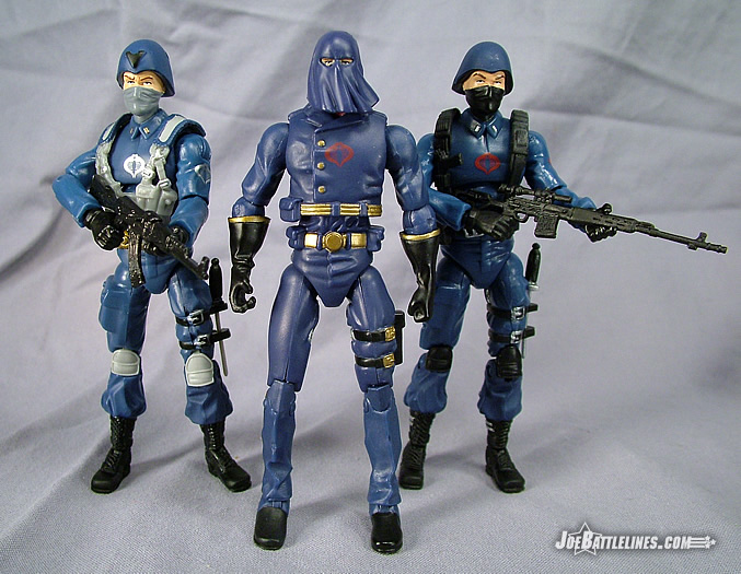
Judging this figure in comparison to the rest of the 25 th Anniversary line makes him one of my favorite pieces released thus far. His darker color scheme blends in perfectly with Battle Pack Cobra Trooper and the single-carded Cobra Officer. His darker palette also is a much better fit when placed next to the other members of the Cobra high command: Destro and the Baroness. While I still would have preferred to see this figure in scale with the rest of my ARAH and GvC era figures I have to admit that this is a perfect example of Hasbro utilizing a “repaint/ retool” to actually improve upon the original release. Of all of the Cobra figures released in the line thus far, this is the only one that sits on my computer desk—which, in light of my battle pack reviews, should give some indication of exactly what I think of this figure.